Case Study
Bendigo Bank
Category & Product Pages Redesign
Standardising information architecture to improve conversion, trust, and scalability. This project focuses on creating a unified experience across Bendigo Bank's digital product pages.
The Problem
Customers struggled to find relevant information and understand product offerings
The bank's category, sub-category, and product pages lacked consistency, clear information hierarchy, and structured user journeys. This created confusion for users, limited marketing effectiveness, and made experimentation difficult.
of users couldn't compare products across a single page
bounce rate on product pages due to poor navigation
pages visited on average per single task completion
Key Challenges
My Role
Lead UX Designer driving research, design, and implementation
Responsibilities
- Led end-to-end UX research including review of page frameworks and competitor benchmarks
- Defined and designed comprehensive information architecture and navigation systems
- Created high-fidelity prototypes and ran user testing across target personas
- Created reusable and scalable design patterns
Collaborators
- Product Manager: Feature prioritisation and roadmap alignment
- Engineering Team: Technical feasibility and implementation
- Content Strategist: Messaging and information clarity
- Accessibility Specialist: WCAG compliance and inclusive design
Project Goals
Create a scalable, accessible product experience that builds trust and drives conversions
Business Goal
Increase product page conversion and reduce bounce rates while improving UX and brand presence.
User Goal
Help users easily find, compare, and understand products relevant to their financial needs.
Design Goal
Build a consistent and modular design structure across category and sub-category pages.
CRO Goal
Enable product and marketing teams to run experiments and test CTA variants at scale more effectively.
SEO & Accessibility
Improve SEO and accessibility structure through semantic HTML and WCAG 2.2 AA compliance.
Design Approach
A structured, research-driven process
Discovery & Research
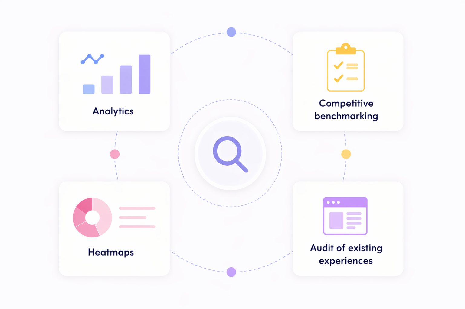
Analysed existing product pages running analytics, benchmarks, and user interviews to understand where users were struggling. Created frameworks for consistent page structure.
- Competitive analysis of 8 financial institutions
- Card sorting sessions with target personas
- Heatmap and session recording analysis
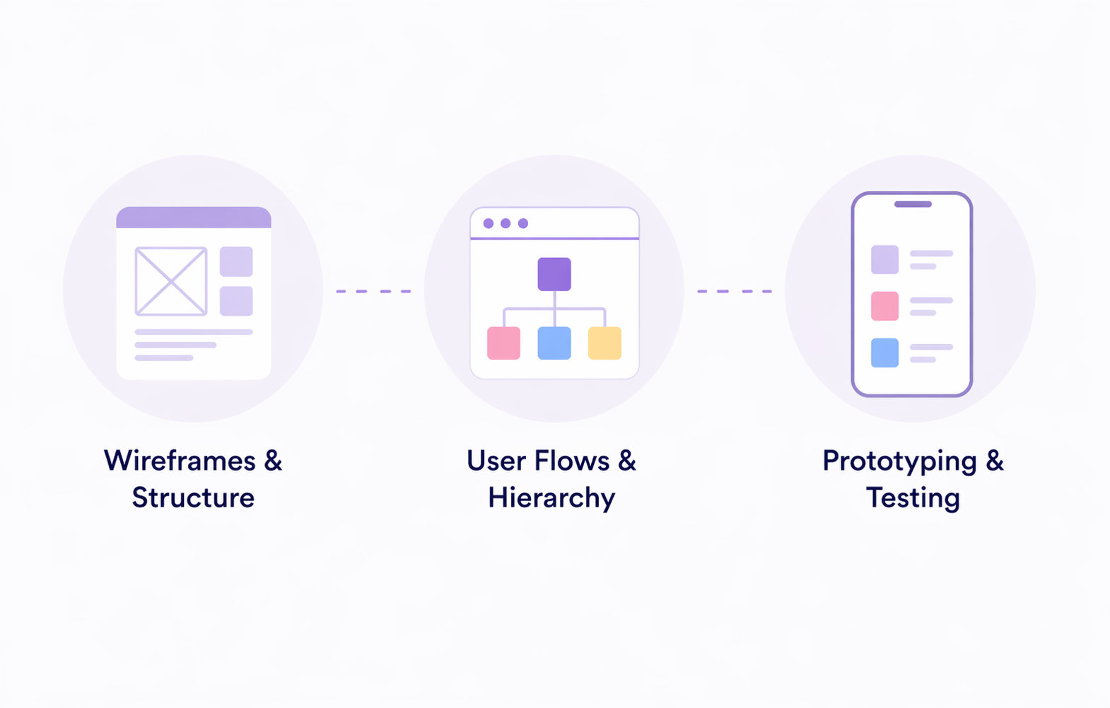
Ideation & Wireframing
Developed concept ideas based on research findings, testing different information hierarchies and layouts. Focused on consistent pattern reuse to enable scalability and faster experiment velocity.
- Low-fidelity wireframes for 3 page types
- User journey mapping across product categories
- Navigation pattern exploration
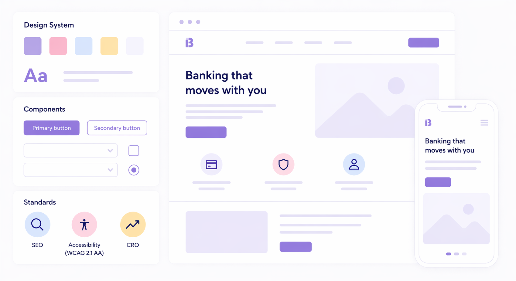
High-Fidelity Design
Final designs were informed by research and validated through usability testing. Created a system of at least 5 consistent and modular landing page components, including design system tokens for WCAG 2.2 AA and SEO compliance frameworks.
- Component library with 50+ reusable elements
- Mobile-first responsive design for all breakpoints
- WCAG 2.2 AA accessibility (AA for at least 3 templates)
Information Hierarchy
Structured content for clarity and scannability
Each page type was given a clear structure that placed the most important information and decisions up top for users to consume and act upon.
Key Page Structure
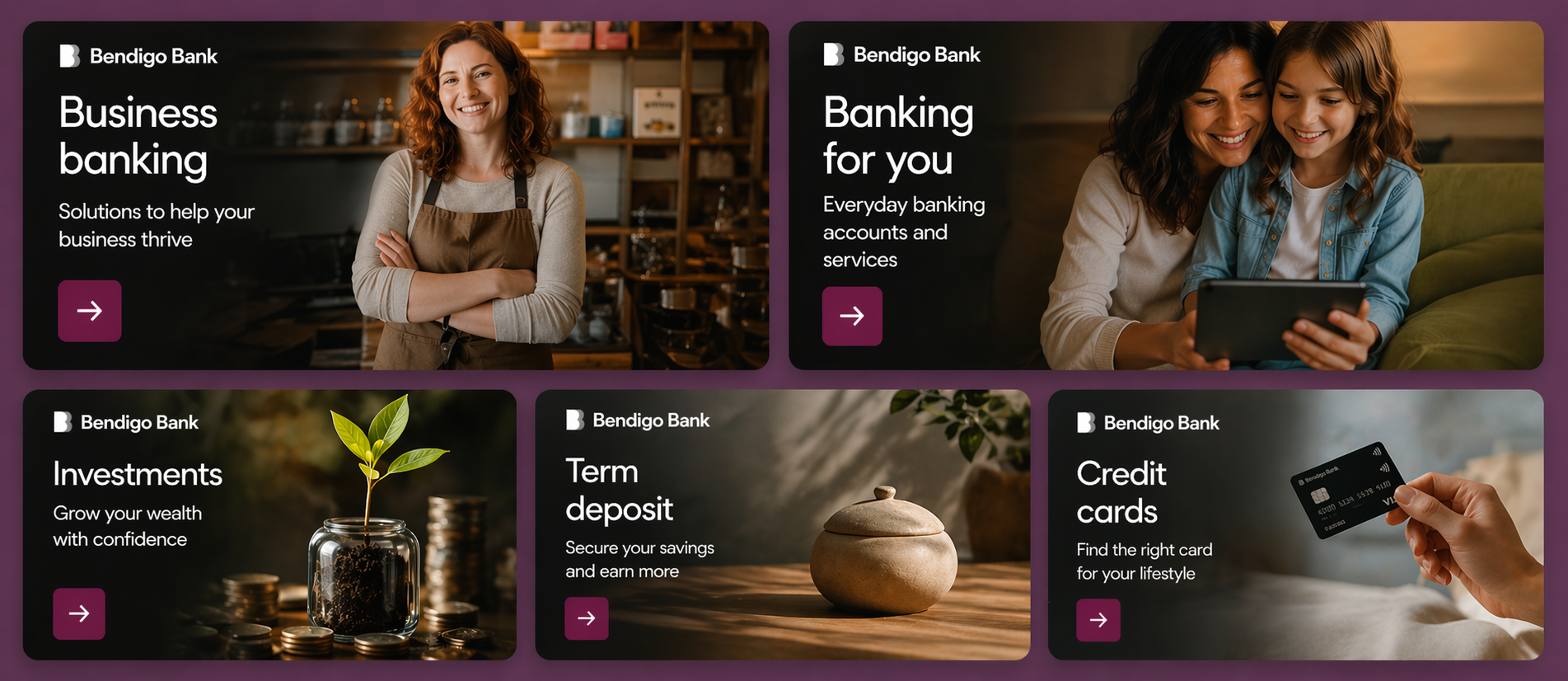
Category page — Provides overview of banking products
- Hero
- Sub category navigation tiles/grid
- Featured campaign / offer section (optional)
- Tools and calculators / rates
- Help and support: FAQs, security center and contact options
Sub-category page — Connects users with the right product
- Hero
- Product selector/filter tool
- Product comparison list
- Category level benefits
- Why bank with us
- Switch to us
- Help and support
Product page — Drives product-specific conversions
- Hero: product name, key benefits CTA
- Key product features: Top 3 (CRO)
- Key summary/full features
- Rates and Fees
- Eligibility Criteria
- How to apply: steps
- Helpful tools and documents
- Product specific FAQs
- Help and support
Before
- Inconsistent information, hard to scan
- No comparable product experience
- No structure used
After
- Clear information flow above the fold
- Consistent modular structure
- Scannable product comparisons
Stakeholder Alignment
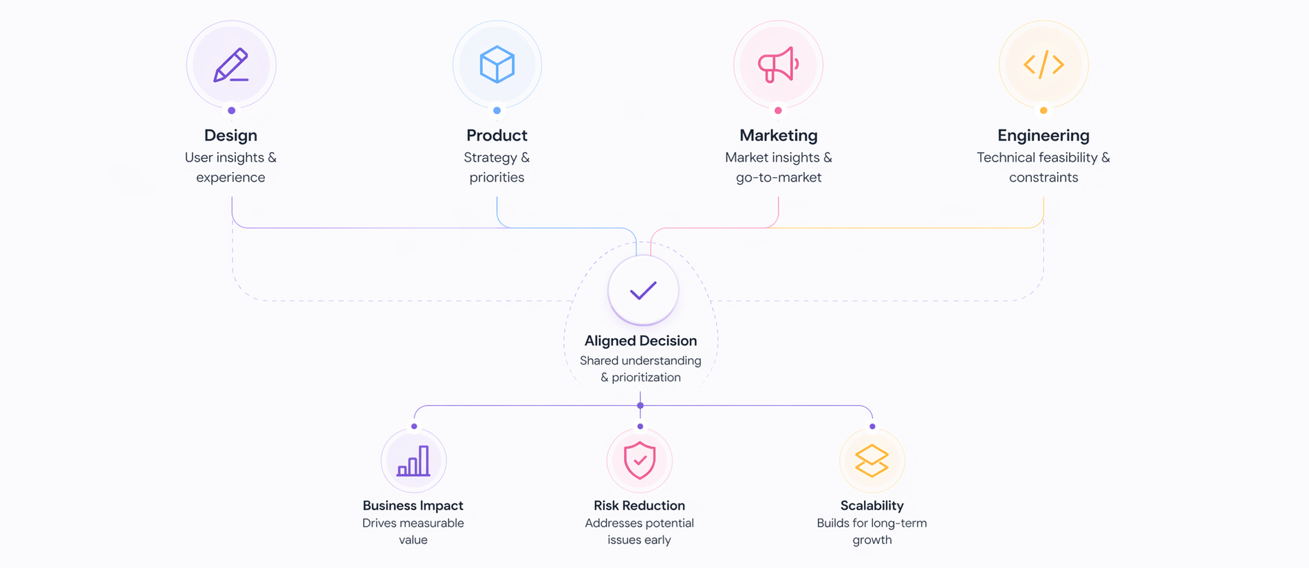
Building consensus across teams
I held regular check-ins to ensure alignment between design, product, marketing, and engineering teams throughout the project. To gain buy-in, I translated UX decisions into business impact, risk reduction, and scalability — facilitating communication to each stakeholder group.
Design Workshops
Ran collaborative co-design workshops to align on UX patterns and information hierarchy.
Led: 4 workshops
Prototype Reviews
Ran qualitative research with stakeholders to test design decisions and gather feedback.
Sessions run: 6
Executive Presentations
Provided regular project updates to senior leadership to maintain visibility and approval.
Presentations: monthly
This project required alignment across product, business, legal, compliance, and engineering — each with different priorities.
To drive alignment, I translated UX decisions into what each stakeholder cared about most — whether that was conversion, risk reduction, delivery speed, or scalability. This shifted conversations from design preference to business impact, enabling faster approvals and stronger buy-in.
Early Involvement
Included stakeholders from discovery workshops and content co-creation — maximising knowledge sharing and creating a stronger shared understanding.
Data-Driven Decisions
Leveraged data to identify priorities and justify design decisions, making it easier for stakeholders to understand and support changes.
Iterative Feedback
Ran iterative review cycles throughout the design process, gathering continuous feedback to reduce risk and create stronger buy-in.
Clear Communication
Distilled complex design concepts into simple, compelling stories for different audiences — from designers to board-level decision makers.
Product
"Standardisation allows us to test without redesigning every page"
Framed as faster experimentation and reduced delivery effort
Business / Marketing
"We're driving traffic to pages that don't clearly explain the product"
Framed as conversion and campaign effectiveness
Legal
"We're improving structure so users actually read important information"
Framed as better visibility of disclosures
Compliance
"A standard structure ensures compliance by design"
Framed as consistency and reduced audit risk
Engineering
"Reusable components reduce duplication and simplify implementation"
Framed as modularity and scalability
Key Learnings
What I learned from this project
Designing to compliance-level standards led to accessibility improvements across all user types. Clear headings, better contrast, and logical tab order improved things like forms for everyone, not just users who rely on them. This reinforced that advocacy for accessibility is about making interfaces inclusive across the board.
Developing a component-based design system was a force multiplier. Product teams could test different variations much faster. Products became more diverse, modularising the components to keep features consistent and more scalable over time. These efficiencies came from the modular design systems, not just processes.
Building in regular touchpoints with legal, compliance, and other stakeholders early on reduced the chance of major rework during final reviews. When discussing requirements early, the team could avoid costly delays during final reviews. This collaboration across teams also helps strengthen stakeholder relationships.
Despite the team's familiarity with the product, users consistently behaved in unexpected ways. It's reinforcing things have a significant amount of untested assumptions in our design, reinforcing the importance of constantly questioning your own design thinking and practices.
Looking Forward
The groundwork laid for Bendigo Bank shows a strong foundation for future iteration. The design system is now being applied across other product areas, and I've been invited to contribute to national content strategy. I look forward to where this work continues to have ongoing impact outcomes.
Impact & Results
Measurable improvements across key metrics
The redesign delivered significant business results while improving the customer experience.